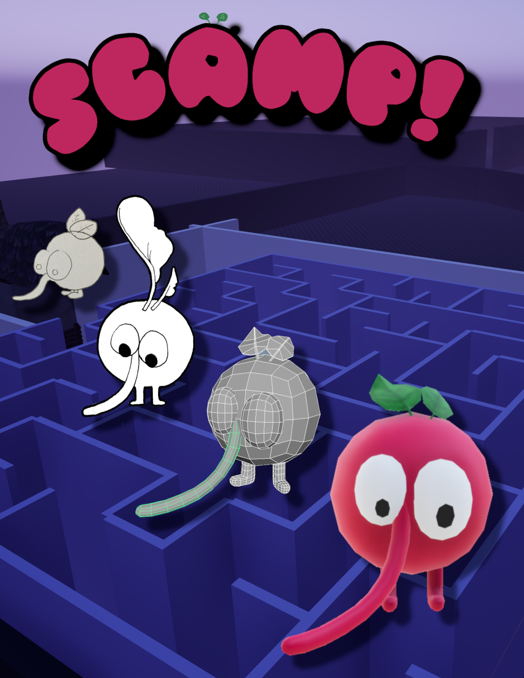
Scamp!
Project Lead
Scamp! Is a game jam game turned personal project playground. Initially created for the 72 hour NJIT IGDA Retro Jam, Scamp! was designed and themed based on classic N64 collectathons like Super Mario 64 and Banjo Kazooie. Since the game jam date has long passed, I use Scamp! as a test ground for experimental effects and systems in an environment free of failure.
Project Tasks
- Design Project According to Limited Scope
- Program Cohesive Characters and Systems
- Coordinate With Artists
Designing According to Scale
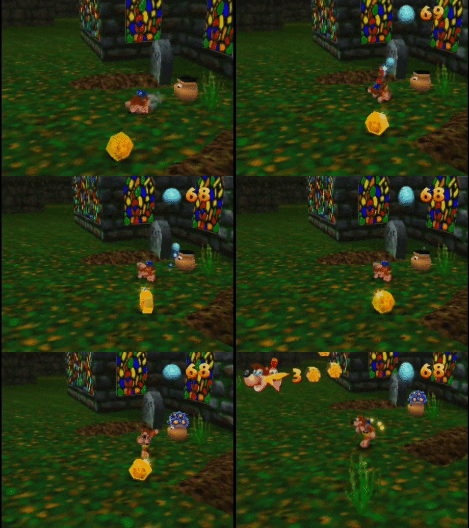
During the initial jam, I intentionally chose a collectathon inspired design because of their modularity. I found that games like Super Mario 64 and Banjo Kazooie aren’t designed especially tightly; rather, those games merely have design themes of 3d exploration and platforming. Objectives in these games are quite the grab-bag, nothing is off limits. Banjo Kazooie in particular embraces its loose design with a variety of different minigames, puzzles and platform related challenges. These games are designed more like an amusement park, so I dubbed these challenge modulus: “attractions” . Using this design model for Scamp! would allow me to adjust the scope of the game over the course of the jam without compromising any major mechanics.
Designing the Character
Keeping with the retro theme, it was obvious that my game would need a bold main character; a character that looked like it was plucked right out of the mascot wars of the 90’s. The final design also had to be based on its mechanical potential. Looking at my references again, I knew the character design should convey two things: he has the ability to augment his air maneuverability and he isn’t particularly quick on his feet. I had my concept artist, Mel, come up with some designs in the days leading up to the jam.
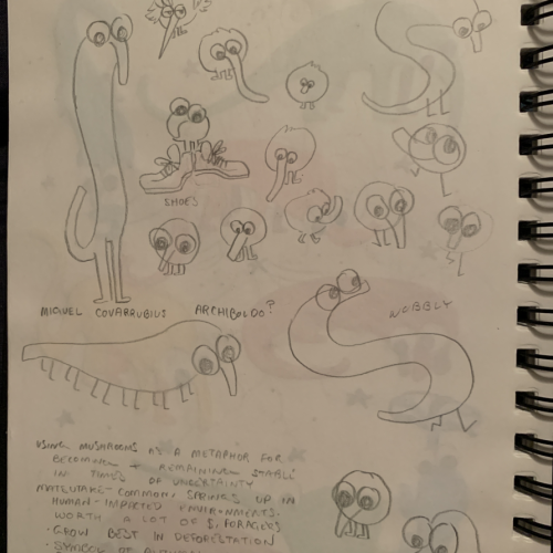
The idea was to just “see what sticks” while also keeping in mind the scope and style of the project. The circle iteration of the character stood out to me. He had an obvious retro look, his simple design would be relatively easy for a 3d artist to script, texture and rig, and his long nose could be used as both an attack and a sort of helicopter. The stubby legs were also ideal; not conveying much speed at all. The persistent mental image of the character scampering around with his tiny little legs and big nose earned him the name, Scamp.
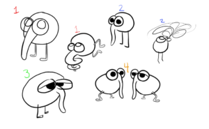
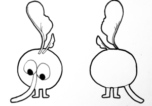
With a clearer idea of the general look and mechanical requirements, I asked both Mel and my other concept artist, Lazarus, to finalize Scamp’s design and convey the type of animation required for our 3D artist.
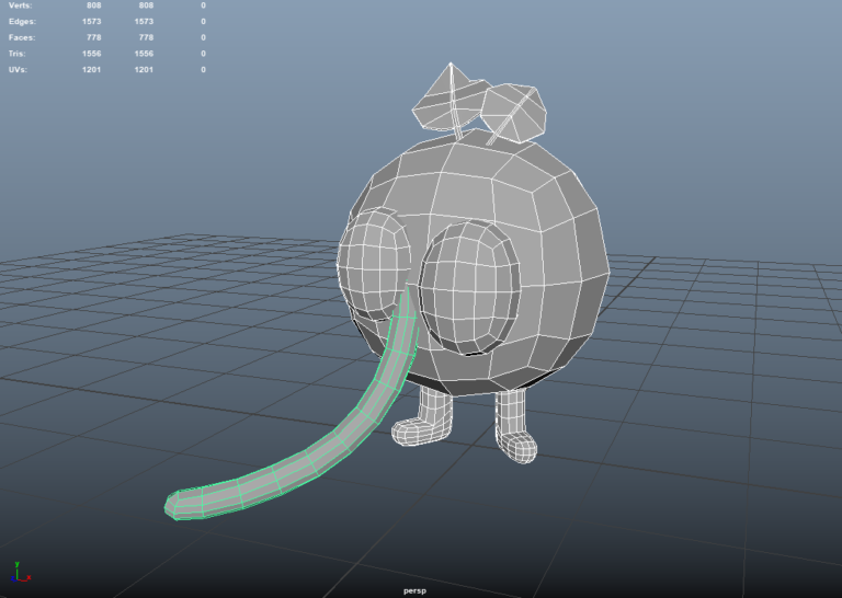
The 3D animation pipeline was completely new to me at the time, but my 3D artist, Brandon, was able to walk me through it partially. Thanks to my design work thus far, I was able to communicate to Brandon the animations I needed and their particulars. What animations had to loop, what animations had to blend between each other, and the speed and impact of the animations were all tuned precisely to my design.
Implementing the Character
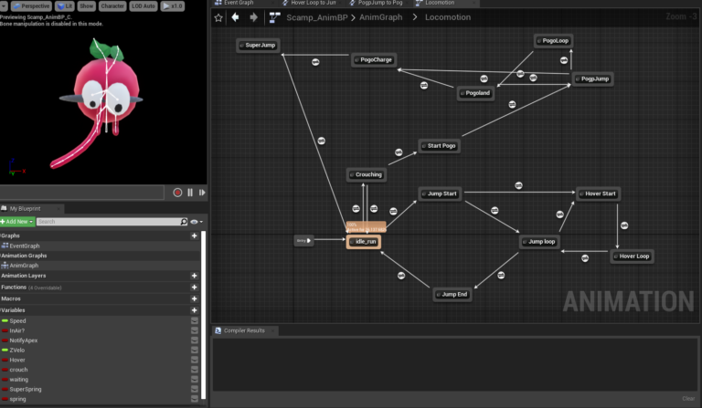
Despite never using Unreal’s Persona suite before, learning how to implement Brandon’s animations was easy. The animation state machine is already intuitive, and my liberal use of enums in the character Blueprint made keeping track of the desired movement mode even easier.
My Persona proficiency was tested however, when trying to implement Scamp’s nose-whip attack. The sphere trace that the attack produced should begin when the nose is in mid-swing and always emanate forward, starting at the nose. To solve the timing issue, I used an “anim notify” during the desired frame and then spawned the trace.
The placement was a little trickier though, I couldn’t get the forward direction of the actor since the animations would rotate the character individually. It was also tough getting a particular bone’s rotation since the bones in the nose would rotate during the animation. What I ended up doing was attaching a custom socket to the nose and then spawning the sphere according to its location and rotation.
Designing the Challenges
Now that the character was completed, I thought I’d finally be able to open up the aforementioned design grab-bag and get to work on some attractions. There was one final main mechanic I seemingly overlooked during my design outline when designing my collectathon, that being the collectibles themselves. I initially thought it’d be as simple as incrementing a counter in the player and displaying that on the HUD. After realizing that the hypothetical counter would be reset on level load, I knew I needed to design a system to pack and unpack important information between levels.
In order to easily digest my collectable problem, I broke it down into three general questions:
What information do I need?
When and where do I need to access this information?
How am I going to get that information there?
Without having a real solid answer for any of these three questions, I knew that my core engine classes could help me out. I knew that one of the only objects that persists between levels is the Game Instance, so information needed to get to and from there. I needed to also keep track of which collectables the player has already collected, so I created an array of indexes in the Game Mode class; each collectable would send its unique index to the Game Mode on collection (though in retrospect, I should’ve just used an array of actor references). Finally, right before a level warp, I needed to pack all the relevant information from the Game Mode to the Game Instance and then unpack it on event begin in the new level.
This solution worked, but having to set the individual index for each collectible seemed like a menial task begging to be automated somehow. Lucky for me, Bluetilities were a new experimental feature at the time. I was able to quickly get all actors of class, and then assign an incrementing index to each of them in the editor. Now, on level load, the collectibles whose index was in the collected float would erase immediately themselves from the world.
The Attractions
Despite my emphasis on a simple and modular design, the tribulations that came with creating the character and the collectable system left little time to develop any sort of attractions. While some of the listed attractions were made within the initial 72 hour jam session, the majority were made months later as part of an academic project.
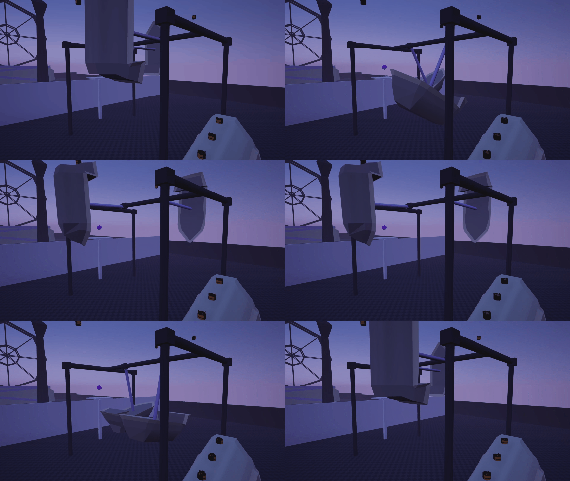
Piggybacking off of the data packaging system, I created a series of attractions that would change functionality based on whether or not the power was on or off. These pirate ships for example, would only swing back and forth once the power has been switched on then allowing the player to access the collectable at the top.
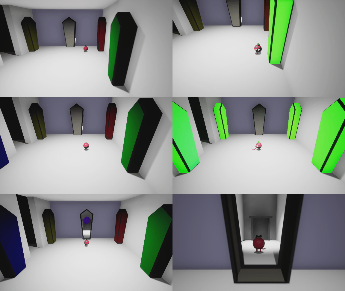
Keeping to the theme, I wanted to add some light puzzle attractions. The best I could come up with was a fully functional Simon game in an isolated little level. The color sequence is completely randomized each attempt, it resets on failure, and it even fails the player if they take too long.
No retro collectathon would be caught dead without a racing minigame, so that’s what I invested the remainder of my time into. I used Unreal’s vehicle character as a base, though it was initially so far from arcade-styled driving physics that I should’ve just made a character from the ground up.
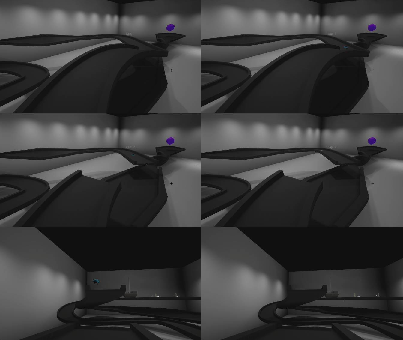
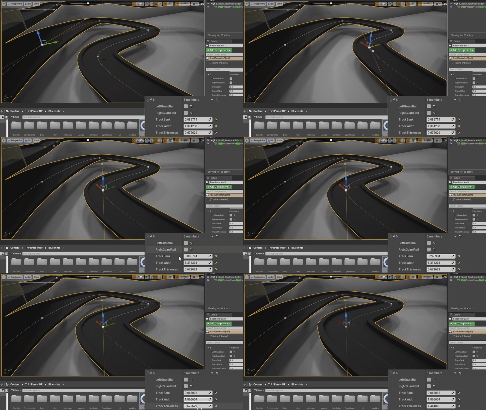
After purging the car of it’s realistic gear shift system and weight, I got to designing the actual race track. The track itself, much like the moving platforms, was completely modular and was editable with a spline and some variables.
